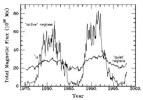

FIGURE 10: A comparison of total magnetic flux within `active regions' and the `quiet sun' defined in the NSO/KP synoptic rotation magnetic maps as >25 and < 25 Mx/cm2. The arrow indicates a pulse of activity in the spring of 1978.
The spatial distribution of activity during these pulses of activity can be traced to the strong tendency for active regions to preferentially emerge within already existing active regions (Castenmiller et al., 1986; Brouwer and Zwaan, 1990; Harvey and Zwaan, 1993). This tendency gives rise to spatial and temporal clustering of active regions in one dominant activity complex, particularly in the rise and decline of a cycle, or many activity complexes spread throughout the activity belts in the maximum phase of a cycle. Figure 11 illustrates one such activity complex, studied extensively by Gaizauskas et al. (1983), that dominated the pulse of activity indicated by the arrow in Figure 10.
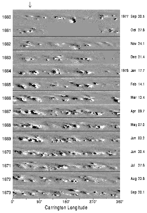
FIGURE 11: Series of NSO/KP synoptic rotation magnetic maps for 12 Carrington rotations: 1660 --- 1673. In these grey-scale images, white indicates areas of positive polarity and black negative polarity. The latitude range of each panel extends from 0o to N90o; this scale is in sine latitude.
The tendency for active regions to emerge within existing regions plays an important role in perpetuating the large-scale pattern of unipolar magnetic flux apparent on the solar surface at all but the minimum phase of a cycle. These large-scale patterns are produced by the dispersion of the active region magnetic by the supergranular flows, differential rotation, and meridional motions which ultimately carry the flux to the polar regions. Only a small portion (< 30%) of the magnetic flux that originally emerges in active regions participates in this process, and by the time the dispersing magnetic flux reaches the poles, only about 1% remains at the surface.
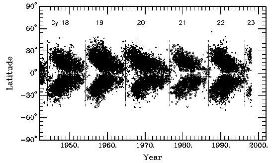
FIGURE 12: The butterfly diagram latitude-time plot of sunspot regions from 1942 to the present. Cycle membership is based on latitude and polarities of regions; o's are the odd-numbered cycles and +'s even-number cycles. The times of cycle minimum are shown by the light, dotted vertical bars.
Figure 13 is a butterfly diagram of magnetic flux constructed from the NSO/KP synoptic rotation magnetic maps. For each rotation, the net magnetic flux (the arithmetic sum of the positive and negative flux corrected for geometric effects) was summed across all longitudes for each latitude bin. Each rotation represents a column in the diagram shown in Figure 13.
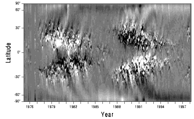
FIGURE 13: A latitude-time grey-scale image of net magnetic flux based on the NSO/KP synoptic rotation magnetic maps from April 1975 to the present. White depicts positive polarities and black negative polarities.
This butterfly diagram clearly shows the activity belts in the northern and southern hemisphere that coincide with the sunspot butterfly diagram. Of note, however, is the overall polarity pattern; the follower polarity of active region occurs along the poleward side of the activity belts and the leader the equatorward side. This pattern is reversed between the northern and southern hemispheres and in successive cycle in concert with the reversal of the polarities of the leader and follower portions of active regions between hemispheres and with each new cycle. Also seen are a succession of long-lived patterns of alternating unipolar patterns of magnetic flux extending from the activity belts to the polar regions. Those streams of the follower polarity ultimately lead to the reversal of the polar fields in each hemisphere during the maximum phase of a solar cycle. Each of the streams can be traced to the emergence of large active regions or complexes of activity, indicating that they result from the dispersal of active region magnetic flux.